Showing posts with label LasVegasPrinting. Show all posts

Thursday, September 29, 2016

Some of the Silver State’s most spectacular landscapes went on display Monday on Capitol Hill, as a week-long photo exhibit called “Home Means Nevada” debuted in the rotunda of the Senate Russell Building.


Some of the Silver State’s most spectacular landscapes went on display Monday on Capitol Hill, as a week-long photo exhibit called “Home Means Nevada” debuted in the rotunda of the Senate Russell Building.  The clouds mirror the colored rocks at Red Rock Canyon National Conservation Area in this photo by Robert B Park from the "Home Means Nevada" exhibit now on display at the Senate Russell Building on Capitol Hill. (Courtesy of National Parks Conservation Association)

To see this video go to https://shar.es/1xJbbU

Wednesday, April 13, 2016

Nevada Art Printers Tips and Hints Part 1


Getting The Most From Your Print Files Part 1
I profiled my display.
Why don't my prints match my display?

HINT: ITS YOUR "LIGHTROOM"
Welcome to the first part of our series on how the get the most out of our extraordinary prints beginning with the problems we see most often.  We hear this all the time from our clients with dismay. You have profiled your display with the newest state of the art calibrator yet your prints come out too dark or light.
The problem has to be the printer right? I have profiled my display so it can't be me.
Well read on to see the scoop as to why.

Your EDITING ENVIRONMENT is a critical component to your process that does not get nearly enough attention. Back in the days of the darkroom everyone knew that you had to have a controlled room with either a safe-light or complete darkness to allow only the enlarger lamp to expose your papers. I have to give Adobe credit for coining their term of "Lightroom" as it embodies the modern digital editing workflow and really is the key concept of a repeatable editing workflow however we are not talking about the program it's the work space concept we have in mind.
A properly setup editing space is easily as important
as the quality of the display you choose or the power level of your PC
.
We have improperly come to believe that we can simply fix anything in post however a grossly & improperly edited file done in a poor environment can be disastrous to get to print well.
YOUR EDITING ENVIRONMENT NEEDS TO DO THESE THINGS:
ELIMINATE COLOR SHIFTS  -  GIVE A PROOFING AREA   -  ELIMINATE TUNNEL VISION


ANY COLOR IN YOUR "LIGHTROOM" WILL CAUSE A BIAS• Regardless of how much you think your monitors neutral wallpaper color is you WILL be influenced by the colors in your editing environment. A neutral grey or white work surface and rear walls will always improve the neutrality of your image edits. Mistake #1 and Mistake #2  are prime examples of poorly setup color biased "Lightrooms".

YOU NEED A PROPER PRINT VIEWING AREA•  This one simple misunderstood aspect IS THE KEY to getting prints that match your display. Your print viewing area needs to accomplish 2 things:

  • Give a color corrected light and place to view proofs.
  • A monitor with its luminance adjusted to properly match the paper white brightness for print matching.

If your monitor white is brighter than your properly illuminated reference paper white then your prints will never be as bright as your display. Go back and set you calibrator luminance to match your environment.

• YOU NEED AN EVEN  ROOM LIGHT SOURCE TO ELIMINATE TUNNEL VISION•  Having a consistent level of light at all times is critical to successful editing. If you have windows that get light at one time of day and not at others it will lead to perceptual edits made in vain as you battle the changing light levels in your room. Many people choose to combat this and edit at night with a dimly lit room however this leads to tunnel vision and a loss of perceptual values as you loose your frame of reference for natural illumination and values as in the sample mistakes.
The bottom line is that unless you have a controlled reference AND a monitor luminance that matches printed output brightness you will  NEVER GET MATCHING PRINTS, only workarounds.
Common Mistake #1
Common Mistake #2
Can You Guess Why?
Why Is This Space Not Good Enough For You.
Can You Guess Why?


AN IDEAL ENVIRONMENT
The "lightroom" shown at the right is an example of an ideal editing environment. With a little studying and understanding of the key elements outlined above you can make great strides to improving your work-space and your print consistency.
A Textbook Perfect Environment

We have used all of the currently available calibrators and recommend above all the X-Rite i1Display Pro as the most accurate, trouble free and consistent results across wide gamut displays.

Friday, February 26, 2016

Friday, February 5, 2016

Check out this wonderful review from Andrew Shoemaker.

Aloha guys! Wanted to first say the ‪#‎print‬ I ordered was definitely amazing and really exceeded my expectations!! The depth was incredible and I really love the metallic look. Secondly, I have a customer wanting 2 ‪#‎images‬ and they preferred the ‪#‎Lumachrome‬ ‪#‎image‬ to metal in person so, ..... Look forward to working with you again smile emoticon Mahalo, Andy

Wednesday, January 20, 2016

Check out this response we got when we sent out samples to this client Tim Whitfield.

"Hello, Robert...all I can say is, "WOW!!"  I just received the sample in the mail today and, honestly, the Lumachrome acrylic is beyond anything that I've ever seen!!  Mark was correct! ...absolutely incredible!! "...
"About 3 weeks ago, I received several prints on Fuji Flex, not acrylic, the cost was basically the same, but the quality...what can I say?  What I saw today in the sample sent was the most amazing print I've seen...ever.  Your expertise only enhances a product unlike any I've seen, Robert...many congrats!!  We'll be doing some business together very soon!!"

Tim Whitfield

Wednesday, December 9, 2015

Most recently we had the opportunity to make some giclee fine art prints for Peter Brock, the designer ofthe #Shelby Daytona Cobra Coupe


Most recently we had the opportunity to make some giclee fine art prints for Peter Brock, the designer of the Shelby Daytona Cobra Coupe.

"Together at Last”
Designer Peter Brock with the six Daytona Cobra Coupes at The 50th Anniversary Of The World FIA GT Champions 1965 at the Goodwood Revival 2015

Monday, December 7, 2015

Our second 9400 Came in today

  • Our second 9400 came in today Yahoo! After sitting at the local depot for five days and four unsuccessful attempts at getting it delivered we finally got it. it's ready to get to use on a series of 60" x 90" acrylic prints going to Thailand

Thursday, November 19, 2015

Critical acclaim from Mark Metternich a world class fine ‪art‬ ‪‎photographer‬ who ventures to the extremes for the ultimate expression of his craft.

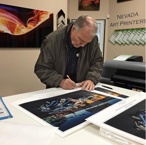
Ok, BIG CHANGES happening with Mark Metternich Fine Art Limited Edition Prints! It looks as if I am going to go EXCLUSIVELY with HIGH DEFINITION LUMACHROME PRINTING (Acrylic Mount) for all my work. I spent several hours yesterday with friend and owner of Nevada Art Printers (Las Vegas) Robert B Park and I am now convinced his Proprietary printing method is now the very best in the world. Being a huge advocate of Fuji Flex / Super Gloss (and Ilfochrome /Cibachrome before it) as the VERY BEST way to print and display color landscape, I had a hard time believing anything can top it. I am now convinced this NEW printing method beats Flex in EVERY way.


How does it beat Fuji Flex Crystal Archive (and even more so Metal Prints)?
1. More detail (is that even possible?) than Fuji Flex Super Gloss! I will say it again: MORE detail.
2. Even better 3D Quality!
3. Superior shadow detail and color fidelity.
4. Wider color gamut (wider than Adobe 1998 RGB)!
5. 16 bit printing!
6. Equal to Flex as far as NO Texture or orange-peel effect (when mounted to Acrylic).
7. Over double the archival rate of Flex (this is rated over 120 years)!
8. Able to print ever larger than Flex (flex was limited to 49 inches on its smallest side).
9. WAY, WAY, WAY betters Reds!
10. Unlike Flex, it is awesome for Black and Whites!
Is there any other category to consider (unless you are targeting the lower end of course - which then cost may be more important to you than quality)?
I will be making some serious prints in the month to come and I will keep everyone informed.

 Mark Metternich